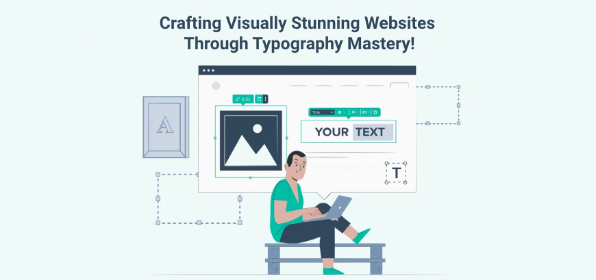
Typography is the art and craft of organizing type effectively. It is a crucial component of web design and can have a significant impact on the overall look and feel of your website.
Typography, which is frequently overlooked, is crucial in web design. It’s not just about fonts; it’s about creating a visual hierarchy, improving the user experience, and communicating the spirit of your brand. In this advanced-level blog, we will go into the art and science of using typography to create visually beautiful and highly effective websites.
Table of Contents
When choosing typography for your website, there are a few things you need to keep in mind:
Use Font Pairings to Create Visual Interest
Combining two or three complementary fonts might result in a more visually appealing and engaging website. You could, for example, use a sans-serif font for headings and a serif font for body content. This will add contrast and hierarchy to your information, making it easier to scan and grasp.
Experiment With Font Weights to Add Emphasis
Different font weights can be used to generate emphasis and contrast. For example, you may choose a bold font for headers and a lighter font for body text. This will help your most crucial material stand out.
Enhance Readability with Kerning and Tracking
Kerning is the separation of individual letters, whereas tracking is the separation of complete words. Changing the kerning and tracking of your text can help increase its legibility and make it easier to read.
Use Line Height to Make Your Text Easier to Scan
The space between the baselines of two successive lines of text is defined as line height. Increasing the line height of your text might make it easier to scan and read, particularly on smaller devices.
Use Whitespace to Create a Balanced Design
Whitespace is the empty space around your text and images. Effective use of whitespace can aid in the creation of a more balanced and visually appealing design.
You Can Also Read: – The Art of Elegance: Exploring the Timeless Beauty of Calligraphy
Examples Of Advanced Typography in Use
Apple: Apple uses a simple but effective typography scheme on its website. The headings are in a large, bold sans-serif font, while the body text is in a smaller, lighter sans-serif font. This creates a clean and minimalist look that is consistent with Apple’s brand identity.
Netflix: Netflix uses a more playful typography scheme on its website. The headings are in a large, bold sans-serif font, but the body text is in a variety of different fonts and sizes. This creates a more dynamic and engaging look that is consistent with Netflix’s brand identity.
Tesla: Tesla uses a more technical typography scheme on its website. The headings are in a large, bold sans-serif font, but the body text is in a monospace font. This creates a more serious and professional look that is consistent with Tesla’s brand identity.
Conclusion
Typography serves as a link between the digital and human worlds. This advanced typographic investigation has revealed critical approaches for creating visually appealing and highly effective websites. You open the door to excellent web design and an upgraded user experience that resonates with your audience by understanding typography.
Seeking an Outcome-Oriented Digital Marketing Firm?
Altis Infonet Pvt Ltd is a Web Development and Digital Marketing company with a focus on client servicing through knowledge-based solutions. Our team of experts will help make your digital dreams come true!